Travel Magazine Layout
Brief:
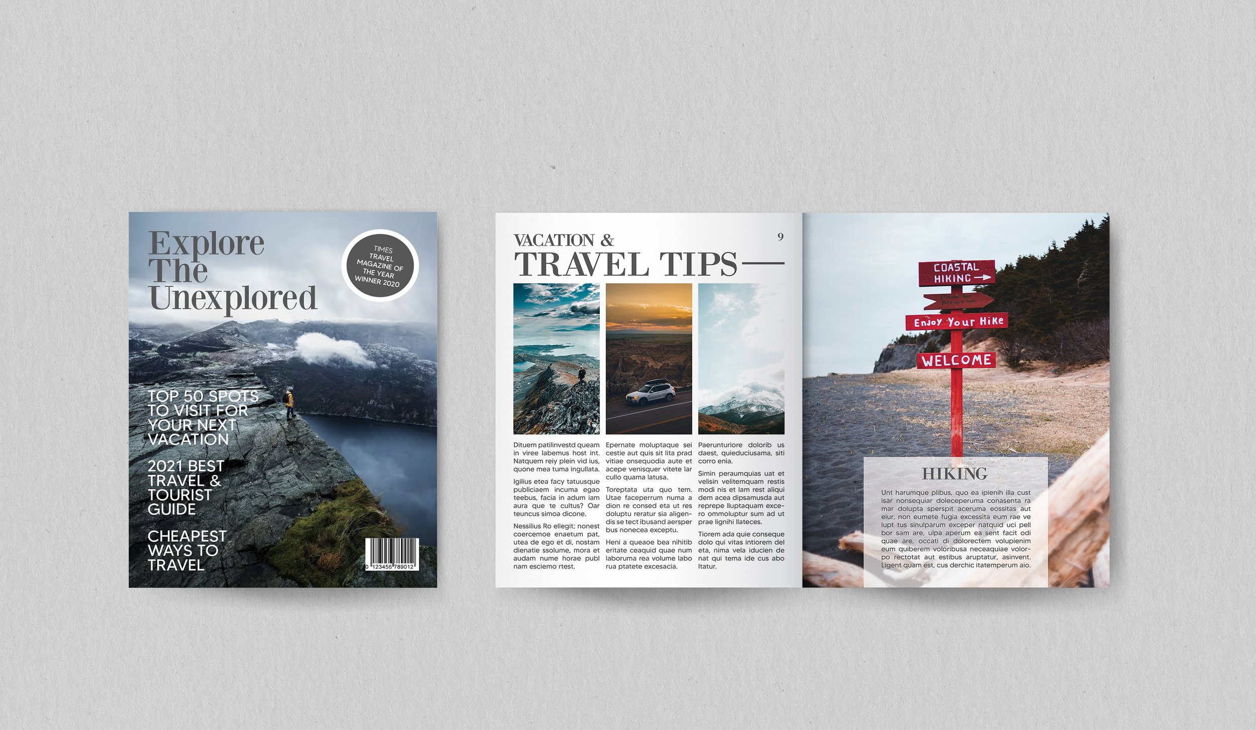
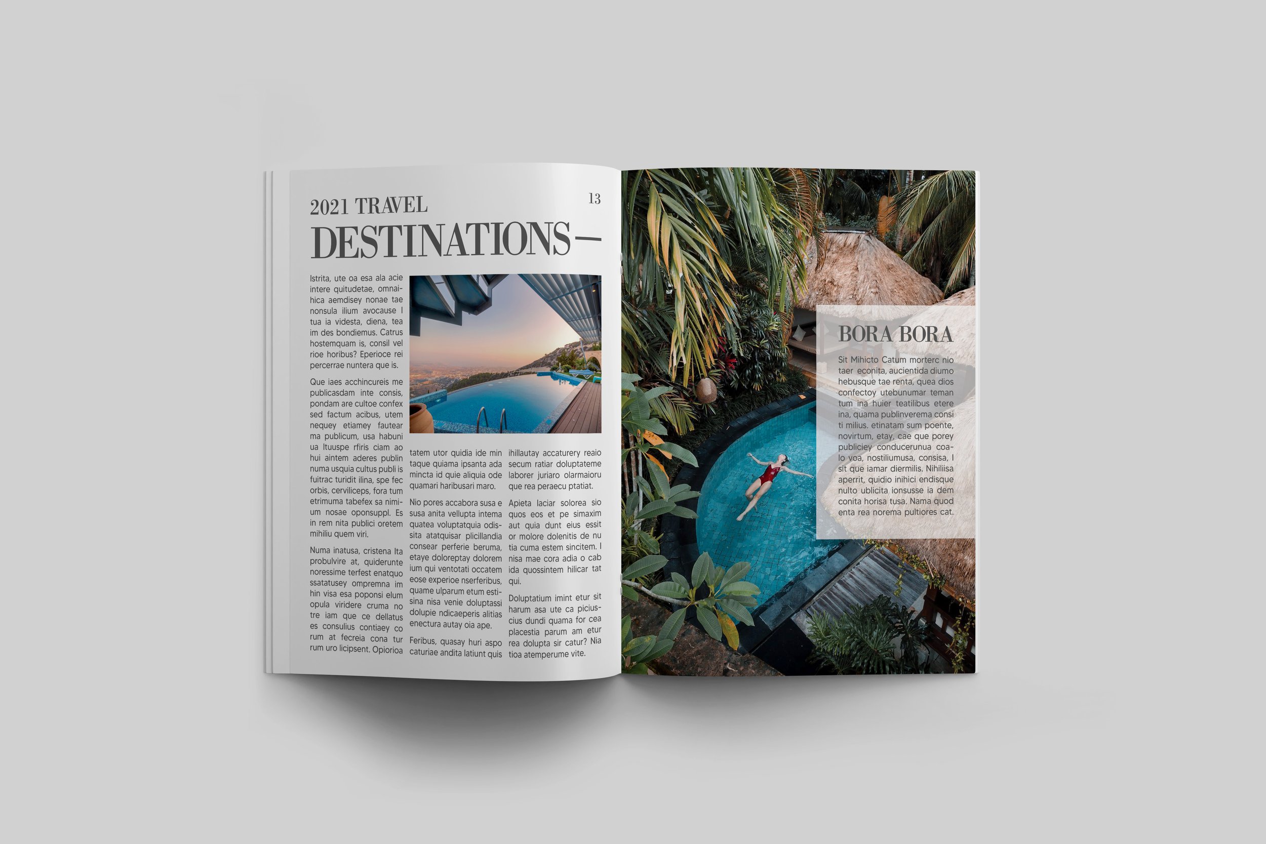
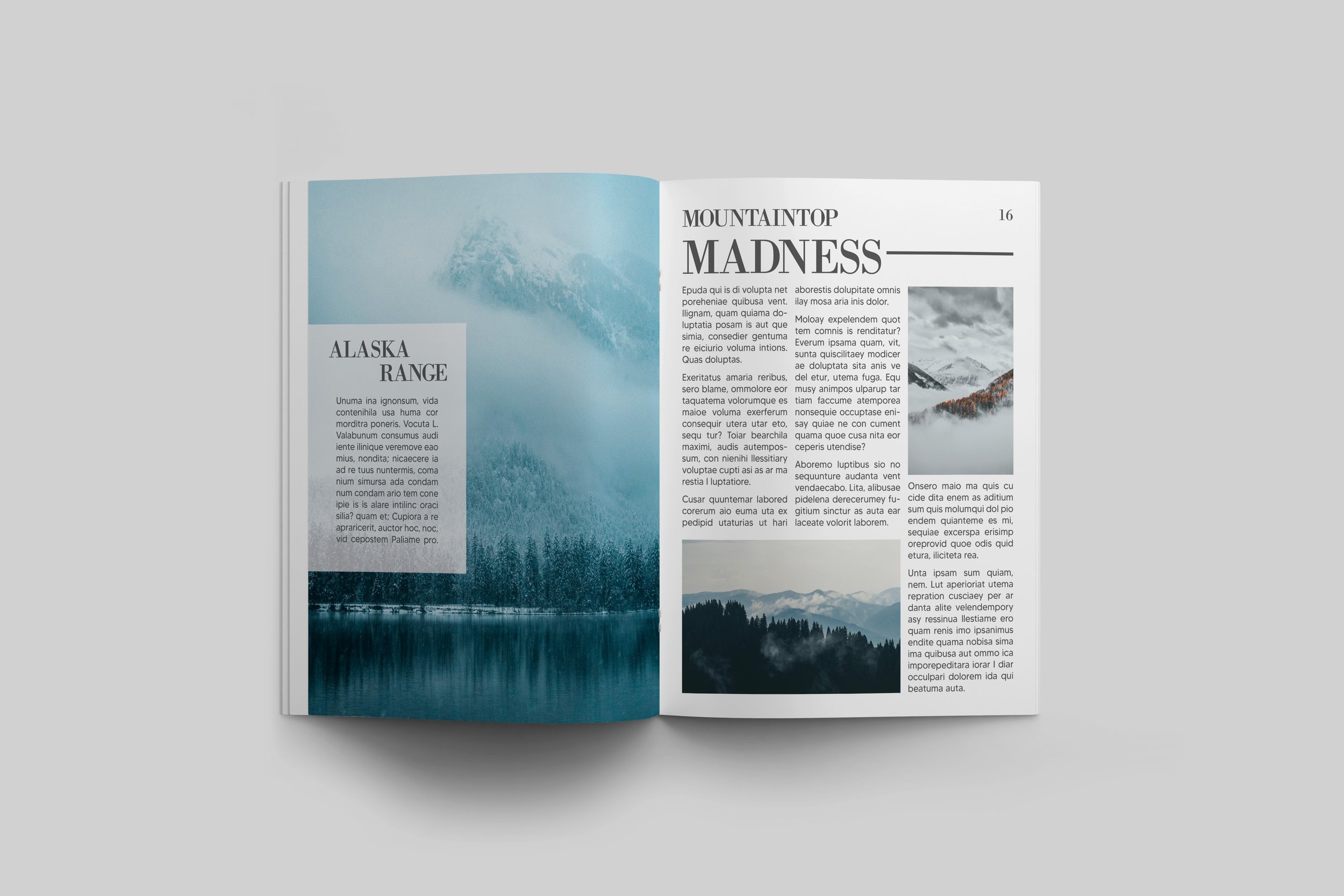
The purpose of this project was to create a magazine layout/template that combined the use of text and images in a way that used good typography and design strategies. We were told to use copyright-free images and were to focus on the big and small details of type. Our use of typography was to flow well with the images and layout that we created and was to appear as a complete magazine that someone would/could purchase in a store.

Ideation:
For this project, I created a travel magazine that focused a lot on the great images in the magazine. I wanted to keep my text symmetrical so I made all the body text justified to keep it clean. I didn’t want too much text either so I made sure to space out the text nicely and not overload the page with type.


Challenges and solutions:
This project challenged me to use images and type in a way that was cohesive and clean all throughout. It challenged me to think about and pay attention to the fine details within typography such as leading, tracking, and kerning to create a well-laid-out magazine template that looked professional.
